Equestrian PR and marketing consultant Rhea Freeman gets the low down on what a rider’s cross-country colours mean — and how they can help them to build a distinctive brand
When you think of a brand, what do you think of? The font they use? The colour of their logo and packaging? There’s a whole world of colour psychology out there to explore and it’s something that brands pay a lot of attention to. But do riders do the same? And what about riders who are very much a brand in their own right? How do they view their cross-country colours and what it says about them?
Brands and colours get linked; in fact some spend a lot of money defending the use of ‘their colour’ as it’s a part of their DNA. Colours generally mean different things to different people, but they also have meanings if you explore colour psychology. So blue can mean calm and yellow optimism, for example. But when deciding what colour to run in, do any of the above factor?
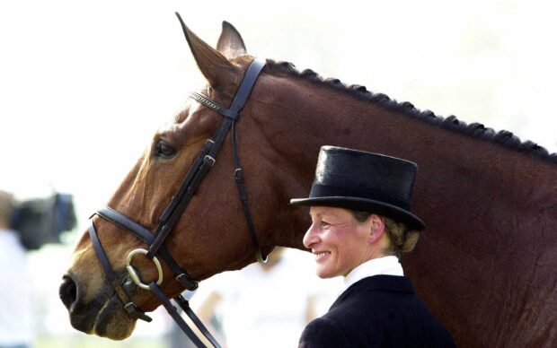
Mary King: green and white
Mary King (pictured, above) is known for the emerald green and white colours she rides in, but these were actually chosen by a sponsor many years ago. “My second ever sponsor was owner of The Classic Horsepower Company, and they asked me if I’d run in their colours, which were green and white,” she says.
“As the company was owned by Gill Robinson’s husband, one of my loyal owners, I said yes. And it stuck. I’d always liked the colour green, so it made sense. I was sponsored by Hiscox for a couple of seasons and ran in their red and black for these seasons, but it didn’t feel like me, so I switched back as soon as I could!”
As any Mary fan will know, green isn’t limited to Mary’s cross country colours — the green has become a big part of her brand with her green being used on her lorry too. In addition, when Mary worked with Joules to create a clothing range, Mary’s green was used on a number of lines.
Paul Tapner: red

Paul Tapner has ridden in red for many years, but only after he forgot to pack his original navy and light blue colours for an event.
“As an avid Aussie Pony Clubber, my zone, zone 23, had red and white as their colours. I was in a lot of zone teams, so I had a lot of red kit,” he says. “When I forgot to take my blue colours to an event, I wore my Pony Club red kit and had lots of comments on how much easier I was to see out on cross-country. When I decided to go pro, I realised the value of having a really recognisable colour.”
Tapner Eventing is a brand that’s known as red, and this is something that although challenging at in the early days, has really helped Paul to attract sponsors latterly.
“Some sponsors want you to ride in their colours, and depending on what the offer is, sometimes it’s the right decision, but for me I was set on red, even when sponsors said it clashed with their branding,” he says.
“It did make it difficult with sponsors when I was relatively unknown, but when you decide to treat yourself as a business, and understand all the marketing and branding that goes along with that, it becomes really important. Any global brand has a colour scheme that is associated with them. Logos change over time, but the main colours stay. It’s important to create a brand image and it’s been valuable for me as a business. It also give sponsors the opportunity to come to me with promotional ideas — they know I’m willing to take things to the extreme and I’m passionate about my brand colours.”
David Doel: red
David Doel, like Paul Tapner, also rides in red, but he started riding in this rather bold shade for different reasons. “I started off riding in red so my Granny knew which one was me going cross country,” he says. “The colour stuck and now most of our things are red, from rugs to buckets, but that’s a good thing. Having such a bold colour has made our team much more recognisable.”
Nicki Strong runs Headstrong Equestrian and has a background in PR and marketing. When she designed her cross-country colours, her brand identity was at the forefront of her mind, and is something she’s maintain through her logo, website and social media. “Everything should be consistent and recognisable as my brand in tone and visually. I use navy, dark red and white on everything. I worked in communications for Macmillan Cancer Support for many years, who are famous for their green; they are a brilliant example of how to us a colour palette as a key feature for a brand.”
Continued below…
Could you be an equestrian brand ambassador?
Find your next set of cross-country colours here
A personal choice
Where do you go to get some customised kit and design your own cross-country colours? And what if you want to stray beyond one colour and incorporate a number into your colours? There are companies set up with this sole goal in mind, one being Super X Country.
“So many people are obsessed with getting the right colour and design,” says Becci Harrold from Super X Country. “The choice of colour(s) and the design is so personal to them and it’s really interesting.
“It’s not so much about building brands for a lot of people, or even building up recognition for people watching, it’s got a lot more to do with good luck and fortune, or just because people like the colour and it’s special to them in some way. Of course, riding in strong colours can be big for building a brand, and keeping that consistency is a big deal and something I think we’ll continue to see more of now that getting personalised cross country colours and accessories is easier.”
Cross-country colours are only one part of your brand, but if it’s something you want to carry through to your website and more, it can be a great way to start to build that brand recognition that you as a business and sponsors want.
For all the latest equestrian news and reports, don’t miss Horse & Hound magazine out every Thursday