Last week, I was lucky enough to be invited to north Germany for three days around the Hanoverian elite auction.
This comes a week after a group of keen, progressive British breeders decided to do something about British breeding’s identity crisis.
Good horses are being born in the UK, but breeders — particularly smaller ones — are struggling to find the right producers (without breaking the bank) and get the youngstock and ridden horses to market, in front of the right people.
 In Germany, I visited the headquarters of the Hanoverian Association. It’s also where the auction takes place — in their 2,500-seater arena — and where the horses are housed for two weeks leading up to the sale (incidentally, the stables and training arenas are open to the public at all times — as is the state stud at Celle).
It was immediately clear that everything the association does has its mark firmly stamped on it; both physically and metaphorically.
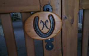
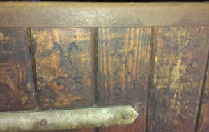
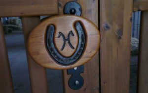
The logo (pictured below) is in the shape of an H with two horse heads at the top of it, facing out. And they’ve chosen two colours; black and yellow. It’s simple and powerful; it’s not twee, but it still says “horse”, and references a similar shape of two horse heads seen on many houses in the Saxony region.
 The yellow and black colours are two elements of the German flag and instantly bring German breeding heritage to mind. So many people at the auction were wearing yellow — scarves, badges, skirts — that even without the logo, the association between the two is there.
At the British Breeding Network (BBN) meeting, it was decided that BBN — and British-bred horses — needed a logo, one that would give it a powerful identity and gravitas.
 I’m no designer, but I’ve thought about it a lot. I wondered what we could learn from the groups who’ve already done the successful legwork — like the Hanoverians. It would probably make sense for any new British logo to incorporate the patriotic red and blue — but with a nod to our diagonal patterns to differentiate ourselves from the Netherlands?
Mind you, the Dutch have adopted bright orange as their colour, so perhaps that doesn’t stand to reason.
The abundance of foreign buyers at the auction highlights the international appeal of the Hanoverian brand; horses were sold to 18 different countries; including Iran, Indonesia, Peru and Japan.
 I saw the Hanoverian logo in all sorts of places: saddlepads, rugs, jackets, shirts, shirt collars, jumpers, headcollars, stable doors, horses’ backsides, bottle openers, pens, aprons, hats, ties, laptop bags, DVDs, umbrellas, picnic blankets, glass doors, door handles, horse brasses, flower pots, sticky tape — you get the idea. It’s EVERYWHERE. And people want to associate themselves with it. It carries prestige.
Granted, they have the luxury of the weight of history, plus significant government funding, but we can still learn lessons — even if the BBN isn’t trying to emulate the Hanoverians, or any other studbook.
The BBN doesn’t want to dictate which societies breeders use to passport their stock; most have systems and books that already work for them, and would prefer to stick with them. But branding and brand identity is important.
Take two pairs of identical jeans. One carries the Levi’s label, but the other is brand-free. Everyone would opt for the Levi’s. It’s about creating the perception of quality, as well as trust in the brand. Then they want to demonstrate to their friends and connections that they’re affiliated with that brand. And so it grows.
So how to move forward in Britain? I think we need to distance ourselves from the cottage industry perception many people have of our breeding industry and a new logo, which has gravitas, simplicity, confidence and — crucially — will reproduce well in whatever size and on whatever medium.
 The aim isn’t to replace studbooks, but why not dream big and create a logo that will ‘travel’ with the BBN/British-bred brand as it grows. Who knows, one day the brand may be so well recognised that people will actually want to brand their horses with it — so let’s find something grabby and clever that can do the job now and in the future — whatever that entails.
Any designers out there up for the challenge?


